You can also get the 1993 edition of the 1:24,000 quadrangles from another government site, CaSIL, and these .tif files do have the correct GeoTIFF tags so that ArcMap knows the projection when it opens them.
The map from BARD is the 1980 edition; according to the collar it was originally created from aerial photographs taken in 1947 for topography; field checked in 1959; revised from aerial photographs taken in 1979—notice the BART, MacArthur freeway, and Highway 24 are all purple, as they date from between 1959 and 1980. A lot of buildings on campus are purple, too. Obviously, it doesn't show anything after 1980. Unfortunately the 1993 edition shows far less detail of buildings, so we can't see what changed from 1980 to 1993. And for anything later than that, you would probably get a satellite photograph.
The USGS has assembled the National Elevation Dataset (NED) from all its topographic maps to cover the entire United States, at a resolution of 1 arc-second (about 30 meters). At the Seamless site you can download a raster of elevation for any portion of the United States you select (subject to file size limitations). The raster arrives as several metadata files and a directory containing .adf files, whatever that is; in any case, ArcMap recognizes it as a raster, opens it, and knows the projection. ArcToolbox has a function to draw "hillshade", i.e., what the surface would look like if illuminated by a light source at a position that you specify. It needs to know the "z factor", the number of ground x,y units in one surface z unit; appropriate z factors can be found in the help screens under Geoprocessing > Geoprocessing tool reference > Spatial Analyst toolbox > Surface toolset > Using the tools > Hillshade.
I downloaded census data from ESRI's site for Montgomery County, Maryland, where I grew up. This county is next to Washington, DC, and has a high concentration of federal government workers at the southern border with the nation's capital. The suburbs of Washington continue to urbanize and expand toward the north, displacing the original agricultural character of the north county.
I explored the different layers for a while, and finally settled on downloading these layers for Montgomery County:
and also the county layer for the District of Columbia. The names of the files that are downloaded are a little cryptic, but they come with a readme.html file explaining what each one is.
 The shapefiles do not come with a
.prj file, but ArcMap notices that the
coordinates are within the range of -180 to 180 and -90 to 90, so it
assumes they are longitude and latitude, and does not issue the warning
about missing spatial reference information. The assumed coordinate system
is shown on the Coordinate System tab of the Data Frame Properties dialog box.
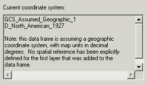
Note that ArcMap assumed the North American Datum of 1927. However, according to
the ESRI
site, the coordinate system is actually "Geographic coordinates NAD83 for the 48 contiguous states, NAD27 for Alaska, and Old Hawaiian Datum for Hawaii".
Again it's necessary to use ArcToolbox to define the projection correctly, under
Predefined > Geographic Coordinate Systems > North America > North
American Datum 1983.
The shapefiles do not come with a
.prj file, but ArcMap notices that the
coordinates are within the range of -180 to 180 and -90 to 90, so it
assumes they are longitude and latitude, and does not issue the warning
about missing spatial reference information. The assumed coordinate system
is shown on the Coordinate System tab of the Data Frame Properties dialog box.
Note that ArcMap assumed the North American Datum of 1927. However, according to
the ESRI
site, the coordinate system is actually "Geographic coordinates NAD83 for the 48 contiguous states, NAD27 for Alaska, and Old Hawaiian Datum for Hawaii".
Again it's necessary to use ArcToolbox to define the projection correctly, under
Predefined > Geographic Coordinate Systems > North America > North
American Datum 1983.
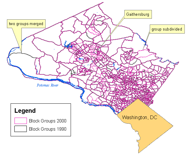
First, look at how the census block groups changed from 1990 to 2000. The census blocks are smallest close to the city of Washington, where population is densest. Where thicker gray lines appear by themselves, it indicates 1990 boundaries that were dissolved in 2000; where thin pink lines appear by themselves, it indicates new boundaries drawn in 2000. Many blocks were subdivided where population is growing, for example in the city of Gaithersburg in the center of the county. Some were merged where population is falling, for example in the farthest west of the county.
I used the Water and Roads layers because the Potomac River and interstate highways are major landmarks to orient the reader; for roads I only symbolized the ones that have a CFCC (Census Feature Class Code) of A15, which represents divided highways. The Label tool on the Drawing toolbar was useful for labeling just a few of the most recognizable features, instead of all the features. I added the county layer for the District of Columbia because its bitten-off diamond shape is also very recognizable, and labeled it "Washington, DC" with the Text tool.
My first map shows the distribution of population. How has the Washington Urban Area grown from 1990 to 2000?
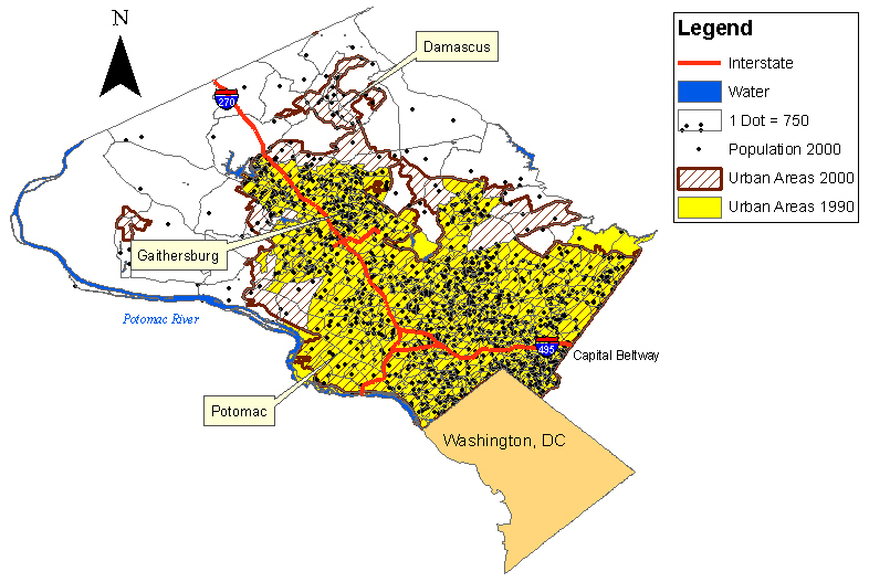
The large yellow polygon is the Washington Urban Area in 1990, which had already engulfed the nearby city of Gaithersburg. (To label it I used the Label tool, clicked "Choose style" and selected the Banner style to get a balloon callout.) In the next 10 years the urban area expanded north and west into the brown hatched areas, spreading to the community of Damascus in the north county.
I can't calculate population density since the attribute table doesn't include area of census blocks; therefore, I symbolized population with dots. There is a dense concentration north of the Capital Beltway: that area has grown recently as the closer-in area gets more and more expensive, and poorer immigrants seek housing farther out from the city. Also, notice how the community of Potomac has a lower population density than the other nearby areas. It is a very affluent community where the residents can afford to use land for country clubs and golf courses.
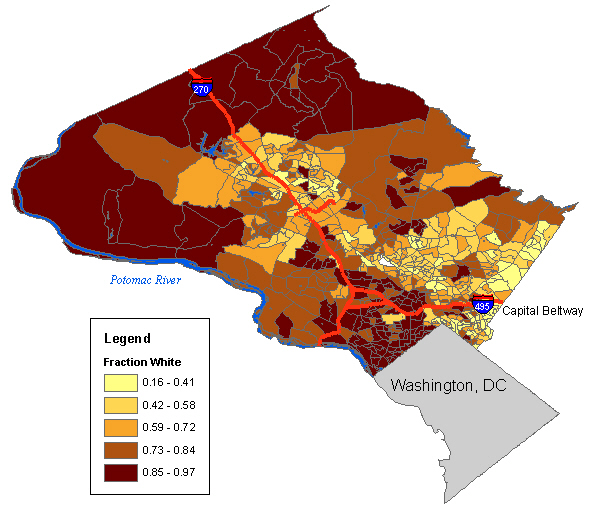
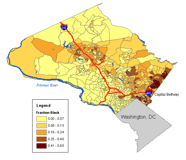
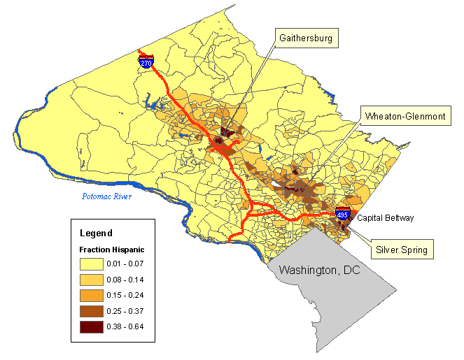
Next I'll look at the distribution of ethnic groups. The percentage of minorities in Montgomery County is increasing fast; in particular, recently there have been a lot of immigrants from Central America, as well as Asia and Africa, and the Hispanic population almost doubled from 1990 to 2000. I thought about finding the data on Hispanic population in 1990 from the Census site to show the increasingly Hispanic communities, but on that site the data is arranged by tracts, and it would take too much time to download the block groups for each tract, combine them all and convert the data table into something ArcMap could open. Instead, I'll just compare the distribution of white, black and Hispanic population in 2000. Where has the new wave of immigrants settled?
|
I symbolized the WHITE field of the attribute table using graduated colors, and selected Normalization by POP2000 to get the fraction of the population that is white. (The tiny empty polygon in the center is actually a park with no inhabitants, so the program automatically omits it.) The parts of the county that are almost all white are the north, where immigration has not yet reached, and to the northwest of Washington, DC, inside the Beltway, where the population is extremely educated, professional and affluent (many lawyers). Whites are a minority in much of the southeastern edge of the county, where there are long-established black communities and also immigration. |
|
Washington, DC is a majority black city, but the black population is not evenly distributed. Likewise, in Montgomery County the black population is concentrated on the southeastern edge, near the large black communities in the next neighboring county to the east, Prince George's County. |
|
The Hispanic population has settled particularly in the cities of Gaithersburg, Wheaton and Silver Spring. The southeastern edge of the county is now highly diverse. |
When I was young, most of the county's schools were in the south near the city, but as I grew up, high housing prices kept pushing younger families farther out, and schools in the south were being closed as new ones were built farther north. Where are the children in the county concentrated now? I tried plotting number of children 5-17 as dots, but it was hard to tell whether the distribution was any different from the distribution of population in general, so instead I plotted median age.
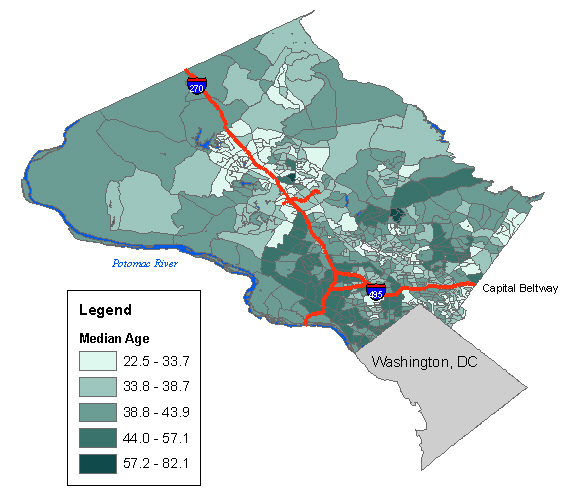
The lower median ages (light colors) appear to be well correlated with the Hispanic population, in Gaithersburg, Wheaton and Silver Spring. These areas will probably need more schools. The median ages tend to be higher in the affluent, white areas northwest of Washington, DC.
In conclusion: It's a lot easier to make a meaningful map when you already know the area! And the other lesson of this lab is that everybody has metadata in a different format, and in particular they often don't supply the coordinate system in the format that ArcMap expects. You have to check to make sure you know what the projection was; don't just use ArcMap's default assumptions, they are often wrong.