
My fave graphic is the globe that has been a part of the logo for the last seven (!?!) years. Can you guess what it really is? Read the following snippets about the logo and how it has changed over the years and you will see!
Above is the 2006 logo.

Above is the 2005 logo. It is essentially the same is the preceeding logos, but with a greyish brown background which is actually a row of brownstones in Harlem. Of course I forgot this and made the 2006 logo very similar.

The 2004 logo sports numbers with a purplish blue light from a 'dawn' picture coming through some trees. It represents the hopeful feelings I had for 2004.

2003 sports a detail from the NYC subway map. It looked kind of cool, and we have finally stopped witching the trains around (except on weekends which is, alas, normal) so it's kind of a tribute to the MTA

2002 was very patriotic. Old Glory shows through the year in this logo. I also went back to the standard colours for the text treatments.

2001 was very grey. Quite by accident in fact. I simply had not come up with the idea of showing faded or blurred images from photos in the year part of the logo. I moved the globe since so many people did not think of it as the last zero in the 2002 version. I turned the text to a dark cobalt blue just because it looked nice. I sliced off the version number and started changing it on my birthday. Since the logo had the year in it, it was changed on New Years Eve.
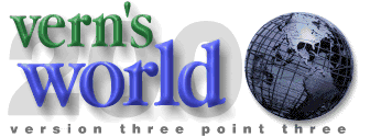
Year 2000! So many zeroes I had to use at least one of them as a "world". Since I still did not have any rendering software. I modified a photo of the Unisphere to make a photo-realistic globe (what better way to achieve photo realism than through photography!) Clearly this is a remake of an earlier logo.
April 1997! In Honour of my 30th birthday I changed the logo on the site and added the version number, which is my age divided by 10.

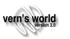
This is the original 1997 design before I turned 30. Each of the pages on the site had one of these devices on it. I really enjoyed making them with Painter! I started learning how to take advantage of some of the features of the software at this point.
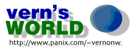
Here's the first attempt at a globe in Vern's World. I didn't think it was good either! The colours I used were blue and green both because they seemed appropriate and because they are my fave colours. It did not dawn on me till later that the "Vern" should be green and the "world" blue. D'oh!